Autopergamene

Back

Portfolio redesign

Published 8 years ago
9mn to read

Redesign of my portfolio

I have to admit to a rather superficial habit - and perhaps shared by others in my profession - when I start talking to someone who does my job, the first thing I do is click on the link to their site. I look at the sources, and from there criticism comes quickly.
It's not logical I admit it because even if I try to follow very well all the good codes and practices in terms of webdesign, I don't always have the time or the means to implement everything yet. But some things are just dealbreakers, like sites that link thirteen CSS sheets and twelve Javascript; non-semantic code full of crossfire between presentation and content; designs that are neither fluid nor responsive, or that are pseudo-proclaimed mobile-friendly but that give the user 24Mb pages.

The double-edged sword is that others also do this and that in heated discussions, my personal portfolio gave a very sad image of me professionally. I did my portfolio shortly before I left school, even before I found my first job (which I still have). At the time, having only web basics and being more oriented towards graphics, I had done it quickly, all in static pages and hadn't touched it since.
As the years passed, I was first proud to show my portfolio, then gradually embarrassed, and finally ashamed. So I rolled up my sleeves, and finally got down to it.

header

Thinking in terms of device-diagnostic

With the explosion of mobile phones, and now tablets - worse, fridges, cars, and so on - everyone goes on the Internet all the time. In this context it has become more and more complex to make sites keeping in mind the old precepts and methods where pretty sites 960px wide were made on Photoshop. This time is over simply because the web is now floating, it is no longer united, it is a bazaar of hundreds of different hardware, each with their own screen sizes, capacities, and so on.
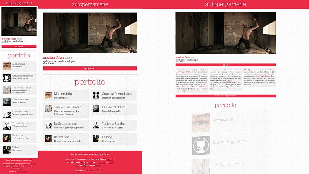
From this came responsive design - altering the style sheet at key points to adapt, hide, display, reorganize the founder blocks as the available space changes. Unfortunately, it turned out very quickly to an Apple fest where if it worked on iPad and iPhone, then we considered it worked everywhere (which is of course completely stupid). The device-agnostic design is the one that readjusts when it breaks, not in relation to any existing phones or tablets, ensuring that the site is prepared for everything that will be released in the coming years. And at the rate it's going, it's the least I can do.

Don't define your breakpoints according to some device, define your breakpoints when your design breaks

I redesigned it to adapt it to the available space. I still admit that I am sometimes guilty of using rather non-agnostic widths, especially on this portfolio. Using my remaining SASS helpers, the major breakpoints are still in the vein of 768px and others.

responsive 00
responsive 01
responsive 02

The design is entirely (ok, mostly) structured by non-fixed units such as percentages of course, but also em and rem. For those to whom these two units are unknown, the em is a variable unit depending on the body of the block on which it is applied. More concretely, within a paragraph having a body of for example 16px, 1em == 16px.
My ideal was to calculate all my margins, heights, bodies etc. in em that would cascade from the general body of the site. The problem is that as soon as you work on titles, for example, the value of an em changes radically and everything gets carried away.

Then comes into play the rem unit or root em which depends in any situation on the body of the site.
Thus a vertical rhythm is maintained, and as all the design is in SASS, a simple change of the body of the site cascades on all the blocks of the site and their margins. This made it easy for me to make the text a little bigger on mobile simply by changing the body size at the root.

html {
    font-size: 100%;
    line-height: 1.5em;
}

@media (max-width: 768px) {
    html {
        font-size: 112.5%;
    }
}

SASS and Compass also allowed me to implement fallbacks to rems for older browsers, since Compass knows the body of the site, it can easily do the corresponding calculations.

myblock
  +rem(margin, 1rem 0.5rem)

// Génère
myblock {
    margin: 16px 8px;
    margin: 1rem 0.5rem;
}

Clean, clear, the browsers who can read the rem read it, the others ignore it and keep the last thing they understand: pixels.

On the web for some time now there are two main principles: graceful degradation and being prepared for the future.
Anything that might break must do so gracefully and must not alter the user experience on a site.
What is already in place must be prepared for future web developments and must not depend on floating technologies.
Many (including me) for this use libraries like Modernizr which allow to test the browser's capabilities and make the site evolve accordingly - but many rely too much on them by forgetting that the CSS by nature ignore the unrecognized properties and thus allows via its cascading principle to respond gracefully to age faults in the visitor's browser.

This is the same principle as when declaring a raw background property with a flat color before declaring a gradient background.

Full use of OOSASS

For a long time, CSS has been a little neglected in the face of other languages. It must be said that at a time when the HTML5/Javascript/CSS standard is being raised, the latter remains the one of the three that takes the longest time to validate the modules, but also the one whose updates are often the most minor.
We have had some major contributions such as CSS3D or rems, but crucial modules such as Flexbox (page presentation and structuring module) that we have been waiting for since the creation of the language are still struggling to show the end of their nose. This is why in many style sheets there is a plethora of prefixes (-webkit-, -moz- etc) quite simply because waiting for these functions to be officially validated and recommended would put you several years behind in terms of webdesign.

In short, CSS is a bit like the ugly duck of the lot and in fact the way to code in CSS has changed little since its creation (at least until the arrival of the preprocessors which made everything explode).

One of the few (if not the only) major changes in the method in recent years is the OOCSS - or object-oriented applied to design. Simply summarized: rather than defining the style of each element one after the other until everything is completed, we identify and isolate patterns in the design that we abstract into modules (in this case classes).
If you have trouble understanding the idea, think for example of famous CSS frameworks like Twitter Bootstrap or Zend Foundation that use the OOCSS. We style the elements like that:

.light-block {
    background-color: rgba(255, 255, 255, 0.5);
    color: #333;
}

.quote {
    text-align: right;
    font-style: italic;
}
<p class="light-block quote">Lorem ...</p>

The styles are abstracted into modules that are then divided into blocks. The style sheet is thus much more concise and optimized according to the DRY principle (Don't Repeat Yourself) so dear to programming. If you want to know more about the OOCSS I can only recommend following people like Harry Roberts who is my point of reference in this matter.

OOSASS only slightly varies in principle but offers several significant advantages. The modules are abstract and defined in the same way as in OOCSS, but rather than via classes, they are defined as SASS placeholders. This implies two changes: you don't apply the modules in the HTML code but in the warmth of your style sheet, which produces pages that are much cleaner and more semantic.
Then, placeholders are generated in the final style sheet only if they have been used, unlike OOCSS modules which must be present in the final sheet since it has no way of knowing which ones have been applied or not (CSS is not basically a programming language).

%light-block {
    background-color: fade(white, 50);
    color: grey(30);
}

%quote {
    text-align: right;
    font-style: italic;
}

.article p {
    @extend %light-block;
    @extend %quote;
}

For this portfolio I have tried to make the most of OOSASS even if I do not have the OOCSS experience of people like Nicole Sullivan whom I recommend to follow as well in passing.

From static to dynamic

My first portfolio was entirely static - the problem with static is that it inevitably involves a large part of copying and pasting whenever you want to add anything. And so it's shit.
On the occasion of redoing my portfolio I decided to redo it entirely under Laravel mentioned in the previous article. Most of the key concepts of what I do have been distributed in models, thumbnails are generated automatically, and I retrieve my photos and albums from Flickr directly from their API via a small homemade quick class.

The entire layout is decoupled into views - each with its own purpose - to allow for a simple and concise update, with hooks at key locations to allow variations as needed between pages.

The database is entirely in SQLite which was more than enough for the few needs I had regarding my database.

Mobile-first

I mentioned above responsive design - it should be noted that there are two schools in this area. **Desktop first and mobile first.
The first is the method that was favoured in the first steps of the responsive because at the time it was a question of adapting existing sites into mobile versions - or else it is practiced by people who had not passed the test and due to habits that still prefer to first make a large version site and then reduce it.

The second approach (and the one that is now widely recommended) is simply the opposite. We start from the smallest possible space, and build from there. Being for a long time part of the above-mentioned category of people having difficulty getting through, this was my first attempt.

The mobile-first is not really a technique in itself, more a subconscious method. When you start from the widest view, you tend to simply hide two or three blocks, pass everything on a column, and wash your hands as if to say, "Well, it works, that's it!".
Starting from a 300px wide frame implies several things that we will do without necessarily realizing it.

On the one hand: the prioritization of content will come naturally. When you have as much space as you want, it's easy to keep stuffing the pages here and there. Having limited space forces you to re-evaluate what content should be highlighted for each page, and to put in place ways to skip/hide secondary content.
Secondly, the content added on the larger spaces will be more in line with the one already in place, since at the top will be well established what is to be highlighted.

I have trouble describing the differences in approaches, but the result is often described and that instead of having a cluttered desktop version and a neglected mobile version, we have two versions treated as equal and just as licked.

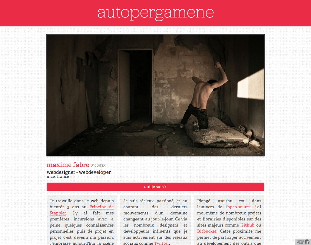
Voir le portfolio

portfolio
portfolio

You can view the portfolio by clicking on the thumbnail above. Note that even this published article, I still plan to improve a few points, and follow more than open to your comments (or possible bugs).

Sources are freely available onGithub, especially in the folder public/app/sass to see the OOSASS I was talking about above.

© 2020 - Emma Fabre - About

Autopergamene

Portfolio redesign

Back

Portfolio redesign

Published 8 years ago
9mn to read

Redesign of my portfolio

I have to admit to a rather superficial habit - and perhaps shared by others in my profession - when I start talking to someone who does my job, the first thing I do is click on the link to their site. I look at the sources, and from there criticism comes quickly.
It's not logical I admit it because even if I try to follow very well all the good codes and practices in terms of webdesign, I don't always have the time or the means to implement everything yet. But some things are just dealbreakers, like sites that link thirteen CSS sheets and twelve Javascript; non-semantic code full of crossfire between presentation and content; designs that are neither fluid nor responsive, or that are pseudo-proclaimed mobile-friendly but that give the user 24Mb pages.

The double-edged sword is that others also do this and that in heated discussions, my personal portfolio gave a very sad image of me professionally. I did my portfolio shortly before I left school, even before I found my first job (which I still have). At the time, having only web basics and being more oriented towards graphics, I had done it quickly, all in static pages and hadn't touched it since.
As the years passed, I was first proud to show my portfolio, then gradually embarrassed, and finally ashamed. So I rolled up my sleeves, and finally got down to it.

header

Thinking in terms of device-diagnostic

With the explosion of mobile phones, and now tablets - worse, fridges, cars, and so on - everyone goes on the Internet all the time. In this context it has become more and more complex to make sites keeping in mind the old precepts and methods where pretty sites 960px wide were made on Photoshop. This time is over simply because the web is now floating, it is no longer united, it is a bazaar of hundreds of different hardware, each with their own screen sizes, capacities, and so on.
From this came responsive design - altering the style sheet at key points to adapt, hide, display, reorganize the founder blocks as the available space changes. Unfortunately, it turned out very quickly to an Apple fest where if it worked on iPad and iPhone, then we considered it worked everywhere (which is of course completely stupid). The device-agnostic design is the one that readjusts when it breaks, not in relation to any existing phones or tablets, ensuring that the site is prepared for everything that will be released in the coming years. And at the rate it's going, it's the least I can do.

Don't define your breakpoints according to some device, define your breakpoints when your design breaks

I redesigned it to adapt it to the available space. I still admit that I am sometimes guilty of using rather non-agnostic widths, especially on this portfolio. Using my remaining SASS helpers, the major breakpoints are still in the vein of 768px and others.

responsive 00
responsive 01
responsive 02

The design is entirely (ok, mostly) structured by non-fixed units such as percentages of course, but also em and rem. For those to whom these two units are unknown, the em is a variable unit depending on the body of the block on which it is applied. More concretely, within a paragraph having a body of for example 16px, 1em == 16px.
My ideal was to calculate all my margins, heights, bodies etc. in em that would cascade from the general body of the site. The problem is that as soon as you work on titles, for example, the value of an em changes radically and everything gets carried away.

Then comes into play the rem unit or root em which depends in any situation on the body of the site.
Thus a vertical rhythm is maintained, and as all the design is in SASS, a simple change of the body of the site cascades on all the blocks of the site and their margins. This made it easy for me to make the text a little bigger on mobile simply by changing the body size at the root.

html {
    font-size: 100%;
    line-height: 1.5em;
}

@media (max-width: 768px) {
    html {
        font-size: 112.5%;
    }
}

SASS and Compass also allowed me to implement fallbacks to rems for older browsers, since Compass knows the body of the site, it can easily do the corresponding calculations.

myblock
  +rem(margin, 1rem 0.5rem)

// Génère
myblock {
    margin: 16px 8px;
    margin: 1rem 0.5rem;
}

Clean, clear, the browsers who can read the rem read it, the others ignore it and keep the last thing they understand: pixels.

On the web for some time now there are two main principles: graceful degradation and being prepared for the future.
Anything that might break must do so gracefully and must not alter the user experience on a site.
What is already in place must be prepared for future web developments and must not depend on floating technologies.
Many (including me) for this use libraries like Modernizr which allow to test the browser's capabilities and make the site evolve accordingly - but many rely too much on them by forgetting that the CSS by nature ignore the unrecognized properties and thus allows via its cascading principle to respond gracefully to age faults in the visitor's browser.

This is the same principle as when declaring a raw background property with a flat color before declaring a gradient background.

Full use of OOSASS

For a long time, CSS has been a little neglected in the face of other languages. It must be said that at a time when the HTML5/Javascript/CSS standard is being raised, the latter remains the one of the three that takes the longest time to validate the modules, but also the one whose updates are often the most minor.
We have had some major contributions such as CSS3D or rems, but crucial modules such as Flexbox (page presentation and structuring module) that we have been waiting for since the creation of the language are still struggling to show the end of their nose. This is why in many style sheets there is a plethora of prefixes (-webkit-, -moz- etc) quite simply because waiting for these functions to be officially validated and recommended would put you several years behind in terms of webdesign.

In short, CSS is a bit like the ugly duck of the lot and in fact the way to code in CSS has changed little since its creation (at least until the arrival of the preprocessors which made everything explode).

One of the few (if not the only) major changes in the method in recent years is the OOCSS - or object-oriented applied to design. Simply summarized: rather than defining the style of each element one after the other until everything is completed, we identify and isolate patterns in the design that we abstract into modules (in this case classes).
If you have trouble understanding the idea, think for example of famous CSS frameworks like Twitter Bootstrap or Zend Foundation that use the OOCSS. We style the elements like that:

.light-block {
    background-color: rgba(255, 255, 255, 0.5);
    color: #333;
}

.quote {
    text-align: right;
    font-style: italic;
}
<p class="light-block quote">Lorem ...</p>

The styles are abstracted into modules that are then divided into blocks. The style sheet is thus much more concise and optimized according to the DRY principle (Don't Repeat Yourself) so dear to programming. If you want to know more about the OOCSS I can only recommend following people like Harry Roberts who is my point of reference in this matter.

OOSASS only slightly varies in principle but offers several significant advantages. The modules are abstract and defined in the same way as in OOCSS, but rather than via classes, they are defined as SASS placeholders. This implies two changes: you don't apply the modules in the HTML code but in the warmth of your style sheet, which produces pages that are much cleaner and more semantic.
Then, placeholders are generated in the final style sheet only if they have been used, unlike OOCSS modules which must be present in the final sheet since it has no way of knowing which ones have been applied or not (CSS is not basically a programming language).

%light-block {
    background-color: fade(white, 50);
    color: grey(30);
}

%quote {
    text-align: right;
    font-style: italic;
}

.article p {
    @extend %light-block;
    @extend %quote;
}

For this portfolio I have tried to make the most of OOSASS even if I do not have the OOCSS experience of people like Nicole Sullivan whom I recommend to follow as well in passing.

From static to dynamic

My first portfolio was entirely static - the problem with static is that it inevitably involves a large part of copying and pasting whenever you want to add anything. And so it's shit.
On the occasion of redoing my portfolio I decided to redo it entirely under Laravel mentioned in the previous article. Most of the key concepts of what I do have been distributed in models, thumbnails are generated automatically, and I retrieve my photos and albums from Flickr directly from their API via a small homemade quick class.

The entire layout is decoupled into views - each with its own purpose - to allow for a simple and concise update, with hooks at key locations to allow variations as needed between pages.

The database is entirely in SQLite which was more than enough for the few needs I had regarding my database.

Mobile-first

I mentioned above responsive design - it should be noted that there are two schools in this area. **Desktop first and mobile first.
The first is the method that was favoured in the first steps of the responsive because at the time it was a question of adapting existing sites into mobile versions - or else it is practiced by people who had not passed the test and due to habits that still prefer to first make a large version site and then reduce it.

The second approach (and the one that is now widely recommended) is simply the opposite. We start from the smallest possible space, and build from there. Being for a long time part of the above-mentioned category of people having difficulty getting through, this was my first attempt.

The mobile-first is not really a technique in itself, more a subconscious method. When you start from the widest view, you tend to simply hide two or three blocks, pass everything on a column, and wash your hands as if to say, "Well, it works, that's it!".
Starting from a 300px wide frame implies several things that we will do without necessarily realizing it.

On the one hand: the prioritization of content will come naturally. When you have as much space as you want, it's easy to keep stuffing the pages here and there. Having limited space forces you to re-evaluate what content should be highlighted for each page, and to put in place ways to skip/hide secondary content.
Secondly, the content added on the larger spaces will be more in line with the one already in place, since at the top will be well established what is to be highlighted.

I have trouble describing the differences in approaches, but the result is often described and that instead of having a cluttered desktop version and a neglected mobile version, we have two versions treated as equal and just as licked.

Voir le portfolio

portfolio
portfolio

You can view the portfolio by clicking on the thumbnail above. Note that even this published article, I still plan to improve a few points, and follow more than open to your comments (or possible bugs).

Sources are freely available onGithub, especially in the folder public/app/sass to see the OOSASS I was talking about above.

© 2020 - Emma Fabre - About