Autopergamene

Why do we use bad color schemes?

Published 6 years ago
5mn to read
Why do we use bad color schemes?

If you’re a developer, odds are most of what you’re looking all day is text and code. Whether it’s in a terminal, editor or webpage, you look at text, it’s our main medium of work. So to make life more bearable and to ease things up for ourselves, we made color schemes to brighten up our lives.
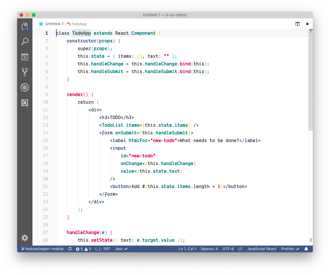
No color scheme
No color scheme

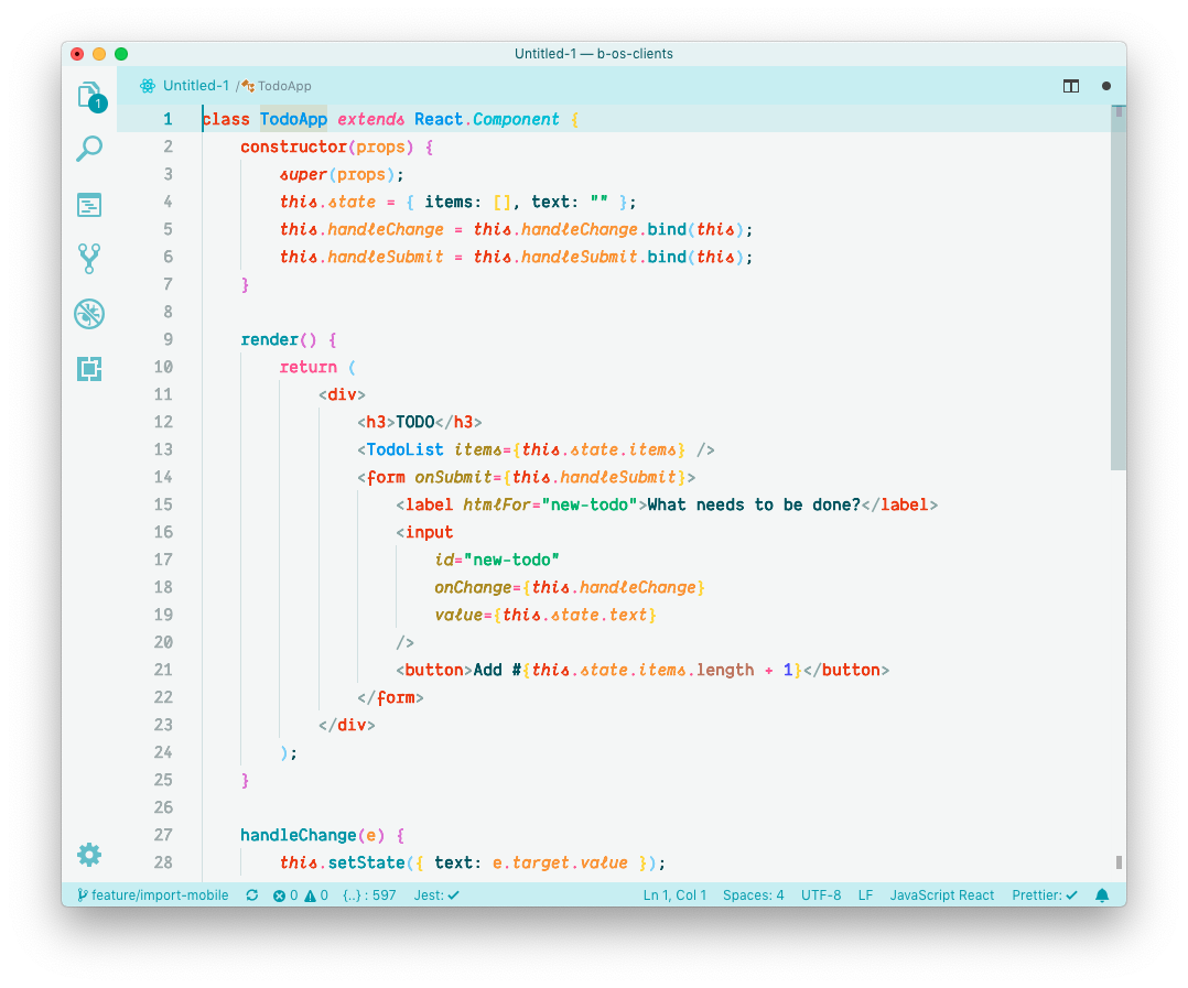
Yes color scheme
Yes color scheme

Colors made it easier for us to parse code because suddenly things weren’t a uniform blob of nonsense. Suddenly, we had visual hierarchy between different things, and it stems from the way we as human react to colors. If something is in bright red, it’ll catch our attention more, even from the corner of your eye. If it’s in a faded grey like for a comment maybe it’s something that requires your attention less than the rest.

And this isn’t something you necessarily realize is happening but it is, color schemes make your brain “sort” what you’re seeing by degree of importance. Which is a very useful thing to have when, like in the case of code, there already is a hierarchy of importance we want to transcribe: functions are more important than comments (don’t quote this out of context please), variables are more important than import declarations, and so on.

And that’s where things start to hurt, because in the years since the introduction of color schemes there are two main categories of them that have emerged:

  • Color schemes that want to be pretty
  • Color schemes that want to be functional

A given color scheme can be both if it’s really good, it can also be neither if it’s really bad, but chances are the person who made it always strive for one over the other because as is often the case in life, functionality happens to the detriment of aesthetics.

What makes a bad color scheme?

So now with that in mind, let’s take a look at a color scheme most of you will be familiar with: Github’s, and why I personally think it’s terrible. Here is the same example as the one above but with Github’s color scheme instead versus another light theme:

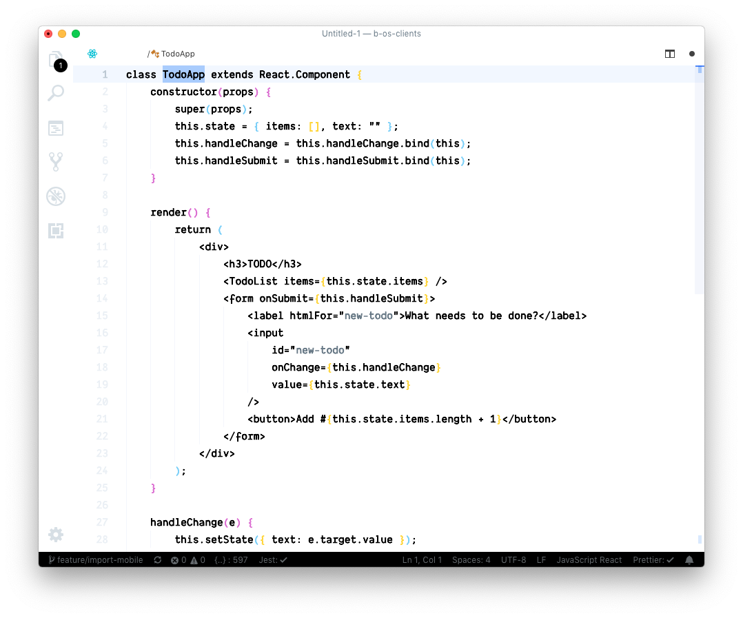
Github
Github

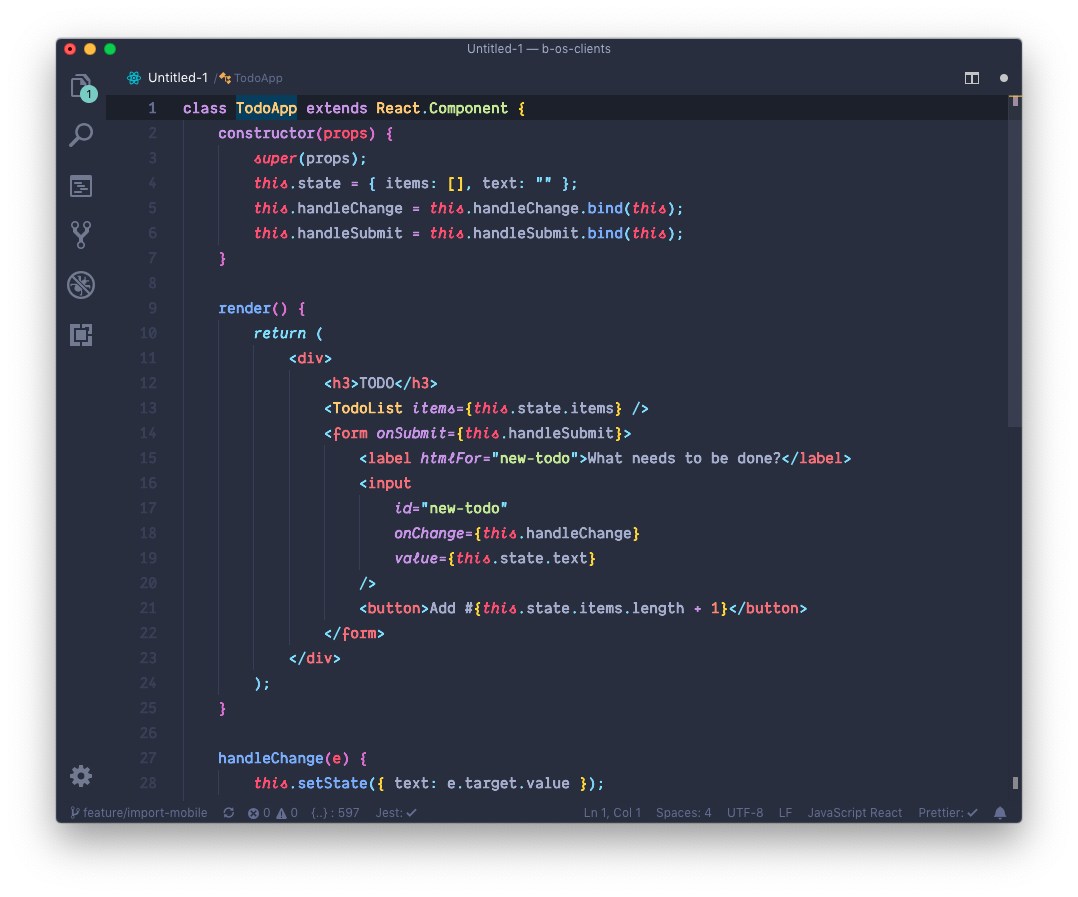
Noctis Hibernus
Noctis Hibernus

The first thing you’ll notice is that Github’s scheme has way less colors, if you look at the thumbnail you mostly see two: blue and red. The second thing that will immediately be visible is that almost everything is blue, so it’s safe to say that what’s in red should be the most important then right? But it’s not.

Instead what’s happening here is that you have to fight the color scheme, you have to make an actual effort to ignore per example the class names in bright red because that’s all your eye wants to see, and yet is it a more important piece of information than the rest? Absolutely not, quite the opposite. Instead, like on the example on the right, we would have maybe wanted the components names to be in a different color to highlight those in the middle of the plain HTML. Maybe we would have wanted the function names in the event handlers to be more important, etc.

I could continue like this for a while but you get my point: the colors in the Github theme don’t relate at all to the contents they’re highlighting. They’re just here to look visually appealing and not strain your eyes too much but they don’t help you in any way, if anything the lack (or misuse) of colors makes it harder to see what’s going on.

Let’s take some other examples, this time from Rainglow which is one of my absolute favorite resource for color schemes. It comes with over 320 themes but that’s not why I like it because most of the schemes in it are – again to me – bad color schemes. Let’s pit one randomly against a very famous one: Material (the Palenight variation per example).
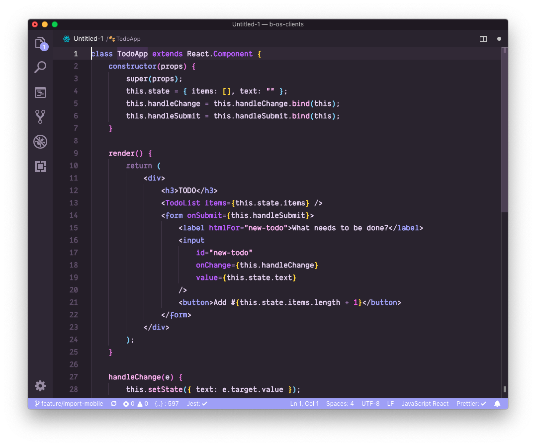
Lavender
Lavender

Material (Palenight)

Again the distinction is quite clearly evident, the theme on the left wanted to be pretty and visually appealing so it resorted to vibrant colors that go well together, but it did so completely at the detriment of functionality. This is a theme I would have a very hard time working in because I’d feel like everything is at the same level, in terms of visual hierarchy.

The theme on the right however, was made to be functional while taking aesthetics into account. It didn’t do a perfect job at it either, some things are in colors that are too “eye catching” for what they represent but it at least tried to convey meaning.

So why do people use bad color schemes?

I say all this, yet I also said I love Rainglow. I regularly use color schemes I’d myself consider bad, so why? Am I just a sucker? Maybe, but more importantly:

Really good color schemes are hard to come by, in all my years of development and scouring the web I haven’t found that many that are actually functional while also not being disgusting. The reason for this is that for a color scheme to be functional above all, it needs to take into account what it’s going to highlight. And that can be literally anything, any programming language, any text (maybe CLI output?), so while you can use tokens and things like that to make a functional theme that will remain so in most languages, it’s bound to fall short in some area or the other.

But more importantly, we don’t just use color schemes for functionality do we? That is only one of the two reasons they exist and I said the first was to look pretty but why do we like pretty schemes? If a theme was 100% functional without taking into account aesthetics, it’d just be a mish mash or random colors and nobody would use it.

The fact is, in an environment that leaves little to customization (text will always be text), color schemes have become a way for developers to not only express themselves and spruce up their daily lives, but also to break monotony. You ever had that feeling, after switching from one color scheme to another after a long while, that this was a new page of your daily life? Suddenly you’re excited to work because you’ll work in those new pretty colors you picked, even if nothing else has changed, the mere fact that the blue screen you look at all day would now be green/red is exciting somehow? You feel renewed motivation, it’s almost as if you had switched editor entirely.

But it’s just colors. And they have a deep effect on us as mammals, we evolved just to be able to see as many of them as we can because it was a radical evolutionary advantage and our brains are still wired that way: colors mess with our minds, literally. Remember the whole blue light/red light thing? Same thing here. And the reality is, switching color scheme often can make us happy, but it also makes us unable to always use functional ones because there aren’t enough of them, so we compromise, for colors. For the prettiness of it and the feelings a given scheme can evoke in us imperceptibly.

Ok big shot so which color schemes do I use then?

The answer will always be the same: whichever pleases you most. I’ve seen people using color schemes I’d puke my breakfast on, and they were super happy about it. Color schemes is like everything that tickles the “beauty receptor” of our brain: you can’t argue with it, you can’t even argue with yourself about it.

So use whatever color scheme you like, but before you do next time maybe ask yourself, am I compromising too much? Am I just being blinded by pretty colors, and enticed to work in something that will actually hinder my productivity, just to see different new shades?

Here are a couple of theme “packs” that I really like and have a good mix of functional and aesthetic themes in them:

  • First of all of course, Rainglow is an excellent resource. It generates 320 themes automatically from swatches, and generates them for most editors and applications. Themes in there are mostly for aesthetics, but it has a good load of functional themes as well.
  • Material themes are also a good option for most editors, they have a couple of variations, use colors in a smart way without sacrificing functionality too much.
  • Finally just for completeness sake, here is the pack I currently use called Noctis, they again to me strike a good balance between the two so they’re the schemes I’m currently on.
© 2025 - Emma Fabre - About

Autopergamene

Why do we use bad color schemes?

Back

Why do we use bad color schemes?

Published 6 years ago
5mn to read
Why do we use bad color schemes?

If you’re a developer, odds are most of what you’re looking all day is text and code. Whether it’s in a terminal, editor or webpage, you look at text, it’s our main medium of work. So to make life more bearable and to ease things up for ourselves, we made color schemes to brighten up our lives.

No color scheme
No color scheme

Yes color scheme
Yes color scheme

Colors made it easier for us to parse code because suddenly things weren’t a uniform blob of nonsense. Suddenly, we had visual hierarchy between different things, and it stems from the way we as human react to colors. If something is in bright red, it’ll catch our attention more, even from the corner of your eye. If it’s in a faded grey like for a comment maybe it’s something that requires your attention less than the rest.

And this isn’t something you necessarily realize is happening but it is, color schemes make your brain “sort” what you’re seeing by degree of importance. Which is a very useful thing to have when, like in the case of code, there already is a hierarchy of importance we want to transcribe: functions are more important than comments (don’t quote this out of context please), variables are more important than import declarations, and so on.

And that’s where things start to hurt, because in the years since the introduction of color schemes there are two main categories of them that have emerged:

  • Color schemes that want to be pretty
  • Color schemes that want to be functional

A given color scheme can be both if it’s really good, it can also be neither if it’s really bad, but chances are the person who made it always strive for one over the other because as is often the case in life, functionality happens to the detriment of aesthetics.

What makes a bad color scheme?

So now with that in mind, let’s take a look at a color scheme most of you will be familiar with: Github’s, and why I personally think it’s terrible. Here is the same example as the one above but with Github’s color scheme instead versus another light theme:

Github
Github

Noctis Hibernus
Noctis Hibernus

The first thing you’ll notice is that Github’s scheme has way less colors, if you look at the thumbnail you mostly see two: blue and red. The second thing that will immediately be visible is that almost everything is blue, so it’s safe to say that what’s in red should be the most important then right? But it’s not.

Instead what’s happening here is that you have to fight the color scheme, you have to make an actual effort to ignore per example the class names in bright red because that’s all your eye wants to see, and yet is it a more important piece of information than the rest? Absolutely not, quite the opposite. Instead, like on the example on the right, we would have maybe wanted the components names to be in a different color to highlight those in the middle of the plain HTML. Maybe we would have wanted the function names in the event handlers to be more important, etc.

I could continue like this for a while but you get my point: the colors in the Github theme don’t relate at all to the contents they’re highlighting. They’re just here to look visually appealing and not strain your eyes too much but they don’t help you in any way, if anything the lack (or misuse) of colors makes it harder to see what’s going on.

Let’s take some other examples, this time from Rainglow which is one of my absolute favorite resource for color schemes. It comes with over 320 themes but that’s not why I like it because most of the schemes in it are – again to me – bad color schemes. Let’s pit one randomly against a very famous one: Material (the Palenight variation per example).

Lavender
Lavender

Material (Palenight)

Again the distinction is quite clearly evident, the theme on the left wanted to be pretty and visually appealing so it resorted to vibrant colors that go well together, but it did so completely at the detriment of functionality. This is a theme I would have a very hard time working in because I’d feel like everything is at the same level, in terms of visual hierarchy.

The theme on the right however, was made to be functional while taking aesthetics into account. It didn’t do a perfect job at it either, some things are in colors that are too “eye catching” for what they represent but it at least tried to convey meaning.

So why do people use bad color schemes?

I say all this, yet I also said I love Rainglow. I regularly use color schemes I’d myself consider bad, so why? Am I just a sucker? Maybe, but more importantly:

Really good color schemes are hard to come by, in all my years of development and scouring the web I haven’t found that many that are actually functional while also not being disgusting. The reason for this is that for a color scheme to be functional above all, it needs to take into account what it’s going to highlight. And that can be literally anything, any programming language, any text (maybe CLI output?), so while you can use tokens and things like that to make a functional theme that will remain so in most languages, it’s bound to fall short in some area or the other.

But more importantly, we don’t just use color schemes for functionality do we? That is only one of the two reasons they exist and I said the first was to look pretty but why do we like pretty schemes? If a theme was 100% functional without taking into account aesthetics, it’d just be a mish mash or random colors and nobody would use it.

The fact is, in an environment that leaves little to customization (text will always be text), color schemes have become a way for developers to not only express themselves and spruce up their daily lives, but also to break monotony. You ever had that feeling, after switching from one color scheme to another after a long while, that this was a new page of your daily life? Suddenly you’re excited to work because you’ll work in those new pretty colors you picked, even if nothing else has changed, the mere fact that the blue screen you look at all day would now be green/red is exciting somehow? You feel renewed motivation, it’s almost as if you had switched editor entirely.

But it’s just colors. And they have a deep effect on us as mammals, we evolved just to be able to see as many of them as we can because it was a radical evolutionary advantage and our brains are still wired that way: colors mess with our minds, literally. Remember the whole blue light/red light thing? Same thing here. And the reality is, switching color scheme often can make us happy, but it also makes us unable to always use functional ones because there aren’t enough of them, so we compromise, for colors. For the prettiness of it and the feelings a given scheme can evoke in us imperceptibly.

Ok big shot so which color schemes do I use then?

The answer will always be the same: whichever pleases you most. I’ve seen people using color schemes I’d puke my breakfast on, and they were super happy about it. Color schemes is like everything that tickles the “beauty receptor” of our brain: you can’t argue with it, you can’t even argue with yourself about it.

So use whatever color scheme you like, but before you do next time maybe ask yourself, am I compromising too much? Am I just being blinded by pretty colors, and enticed to work in something that will actually hinder my productivity, just to see different new shades?

Here are a couple of theme “packs” that I really like and have a good mix of functional and aesthetic themes in them:

  • First of all of course, Rainglow is an excellent resource. It generates 320 themes automatically from swatches, and generates them for most editors and applications. Themes in there are mostly for aesthetics, but it has a good load of functional themes as well.
  • Material themes are also a good option for most editors, they have a couple of variations, use colors in a smart way without sacrificing functionality too much.
  • Finally just for completeness sake, here is the pack I currently use called Noctis, they again to me strike a good balance between the two so they’re the schemes I’m currently on.
© 2025 - Emma Fabre - About